The Czech studios třiarchitekti and ORA have transformed an old vaulted cellar into a stylish boutique: The Prague Gentlemen Store offers men’s fashion and extravagant interior design.
The fact that the capital of the Czech Republic has a lot to offer is world-renowned. Architecture enthusiasts are drawn to Prague, because the city attracts visitors with its historic buildings, but also with its modern architecture and future-oriented projects. And keen shoppers will find everything their heart desires here. A special kind of men’s fashion store now combines both worlds: The Gentleman Store. which has been transformed from an old vaulted cellar into a stylish boutique. Because its skilfully minimalist Interieur gives the clothes a setting worth seeing.
New in the old vault
The renovation of the ground floor and the impressive cellar vaults was carried out according to plans by the Czech firm třiarchitekti. The ORA team, also from the Czech Republic, was responsible for the design of the rooms. The client’s goal: a place where fashion-loving men can find brands that are otherwise only available abroad – in an extraordinary ambience.

The project began with an investor’s wish to extend a residential building. This turned into a larger project: The commercial areas in the basement were also to be structurally prepared for a new use. ‘The main part of our work therefore remains invisible, hidden under neutral, high-quality finishing materials,’ says the třiarchitekti team. With the satisfied follow-up: ‘That’s how it should be. We are all the more pleased that the business premises were rented by an enlightened customer who had the shop designed by ORA.’

A store with a special flair
However, what the třiarchitekti office has done with the old cellar rooms can justifiably be regarded as the ideal preparation for today’s modern, elegant Interieur.
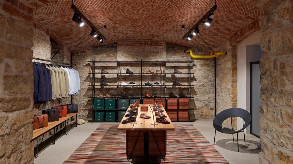
The large vaults were left unplastered. The darker surfaces of the brick vaults and stone walls were complemented by a new light-coloured floor. This consists of polished concrete separated from the old walls by a striking joint. The material palette was deliberately kept to a minimum in order to make the rooms as versatile and timeless as possible.

As far as the ground floor is concerned, třiarchitekti opted for a pure ‘facelift’. The most important intervention is a new terrazzo staircase that connects the basement with the ground floor.
Small interventions, big impact
The architects report that they looked very carefully for the ideal location: ‘We chose a place that creates a natural connection to the entrance. And we found a balance between an economical and convenient solution and the least possible structural intervention.
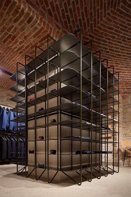
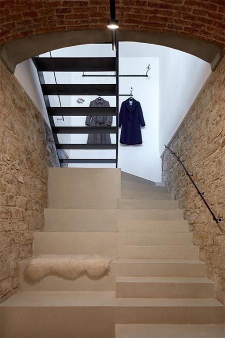
The specialists from ORA, who were commissioned with the interior design saw no need to ‘create an elaborate backdrop or cover anything up’ in the newly renovated rooms. Rather, their design was aimed at harmonious complementarity. At the same time, the design focussed on the fact that quality goods were to be offered for sale on site in the future.
Simple feast for the eyes
And so the ORA team looked for a solution that would fulfil two ideas at the same time: A space that doesn’t look so empty that it resembles a gallery and emphasises individual items too much. But also one that does not make the products look like mass-produced goods due to overcrowding.

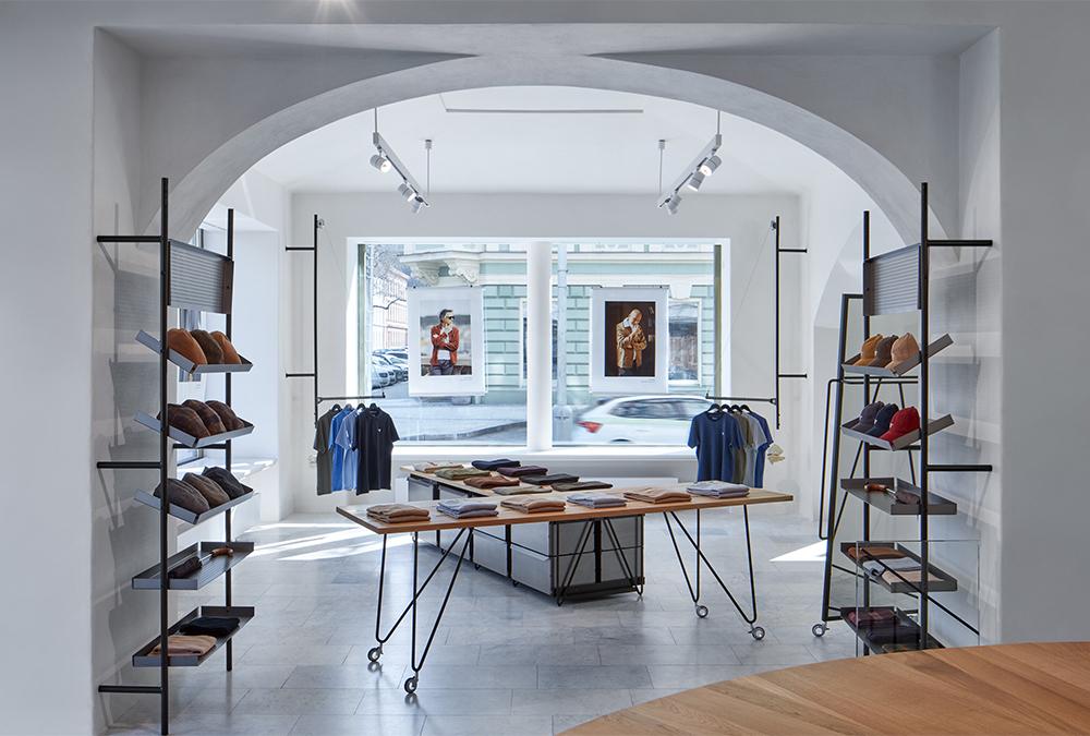
The result supports the purpose of the gentlemen’s store, which focuses on selling high-quality, predominantly British menswear. Accordingly, the interior avoids any ostentation and instead scores with elegant simplicity.
High-quality material for equally high-quality goods
The furnishings are simple and transparent, but carefully crafted in detail and made from a few high-quality materials. ‘We want the interior to be inviting to touch and feel solid,’ describe the designers.
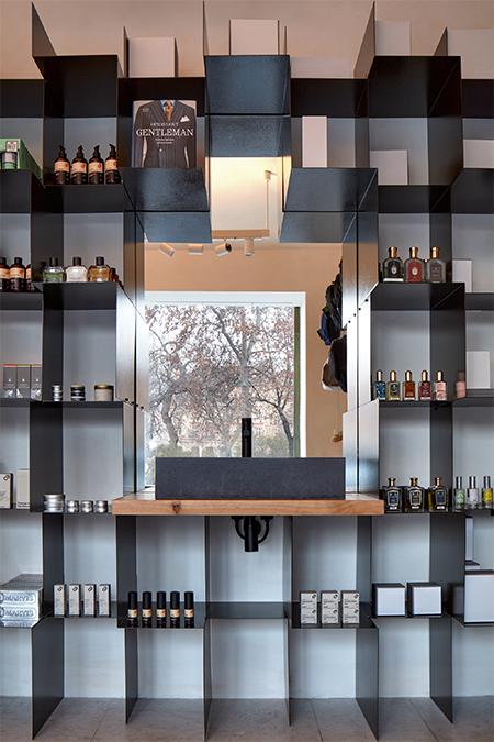
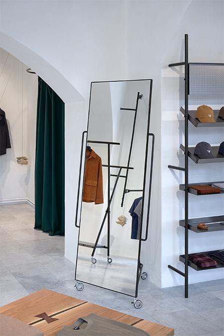
An essential part of the furnishings are sturdy, custom-made tables made from solid oak boards, which are not without their flaws. Striking solitaires that bear witness to careful craftsmanship. The lightness of the construction is emphasised by light, unobtrusive hangers that nevertheless support large quantities of clothing. They are not used for decoration, but for utility. They are balanced by rough stones that were removed from the house during the renovation.
Airy & in love with detail
ORA chose folded pieces of sheet metal for the shelves. Simple raw material that the interior designers used in a simple, repetitive motif. Most of these shelves were designed to be open because, according to ORA, ‘there is no reason to hide the products.’ Hand-woven rugs from „Maimana“, Cocon armchairs and UM stools from Master&Master completed the look of the shop.
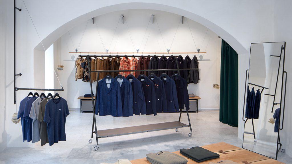
The fact that ORA likes to revitalise structures that are doomed to disappear has more than paid off with the interior design of the Prague Gentlemen Store. Not only the ‘Brit chic’ of the mens´s fashion on offer, but also the shop itself create a harmonious blend of old and new. A mix that should also appeal to lovers of unusual interior design for the new shop in the old cellar vault.
Text: Elisabeth Schneyder
Bilder: BoysPlayNice


