The landmark project directly on Vienna’s Danube Canal impresses with design care and special architecture by INNOCAD. The expressive, monolithic architectural concept with its characteristic form is identity-forming, explained by architect Martin Lesjak. Inside we also took care to create a balance between the urbanity of the capital and nature – with a biophilic series of luminaires. Read more in the interview with Dr. Anastasija Lesjak from 13&9 Design.
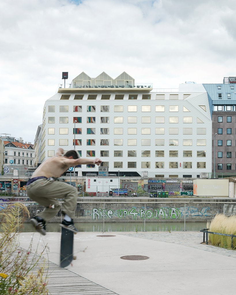
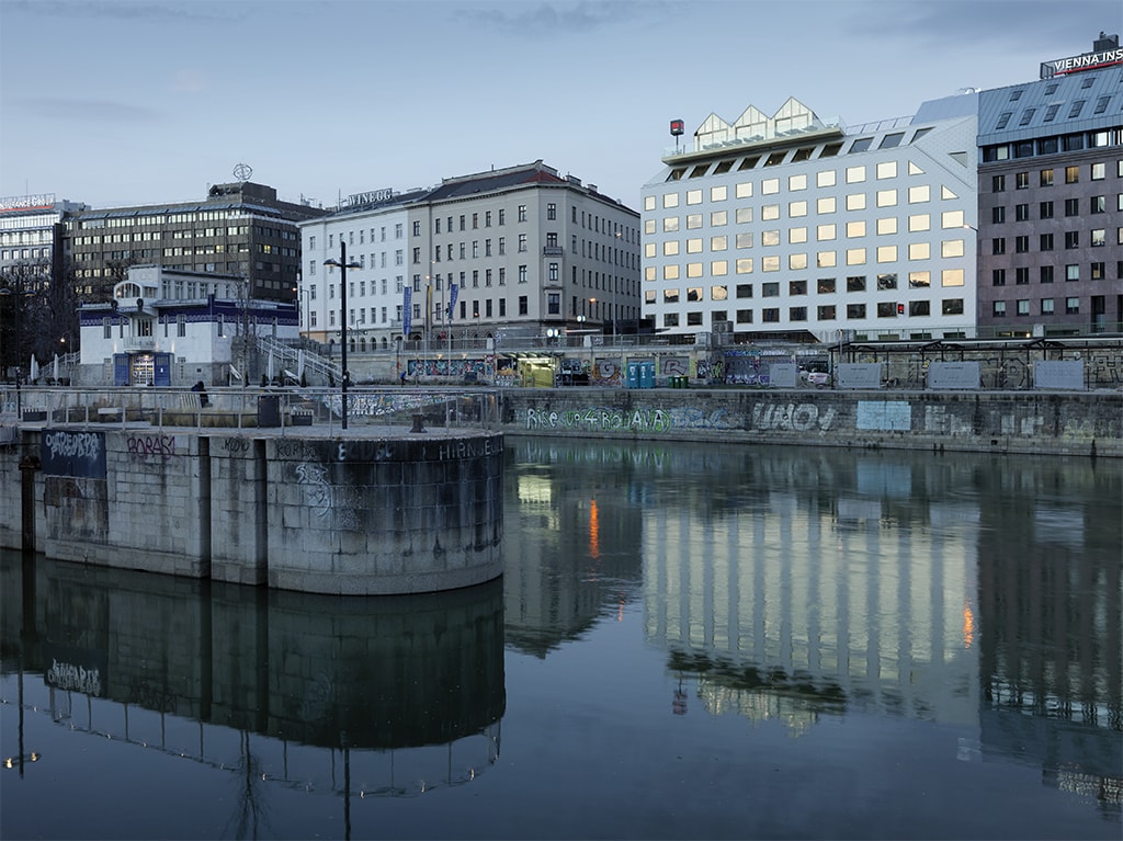
THE ROCK, whose architecture thrives on the tension between the regular window grid and the tectonic folding of the façade, houses the first Radisson RED Hotel in the German-speaking region. This is generated from the requirements of the building regulations and promotes the visual interaction of the building with its surroundings. As a landmark project, the hotel has already received international recognition: Finalist Hotel Design Award 2022 (New Construction), Finalist THE PLAN Award 2022 (Hospitality), Winner European Property Award 2022 (Hotel Architecture Austria).
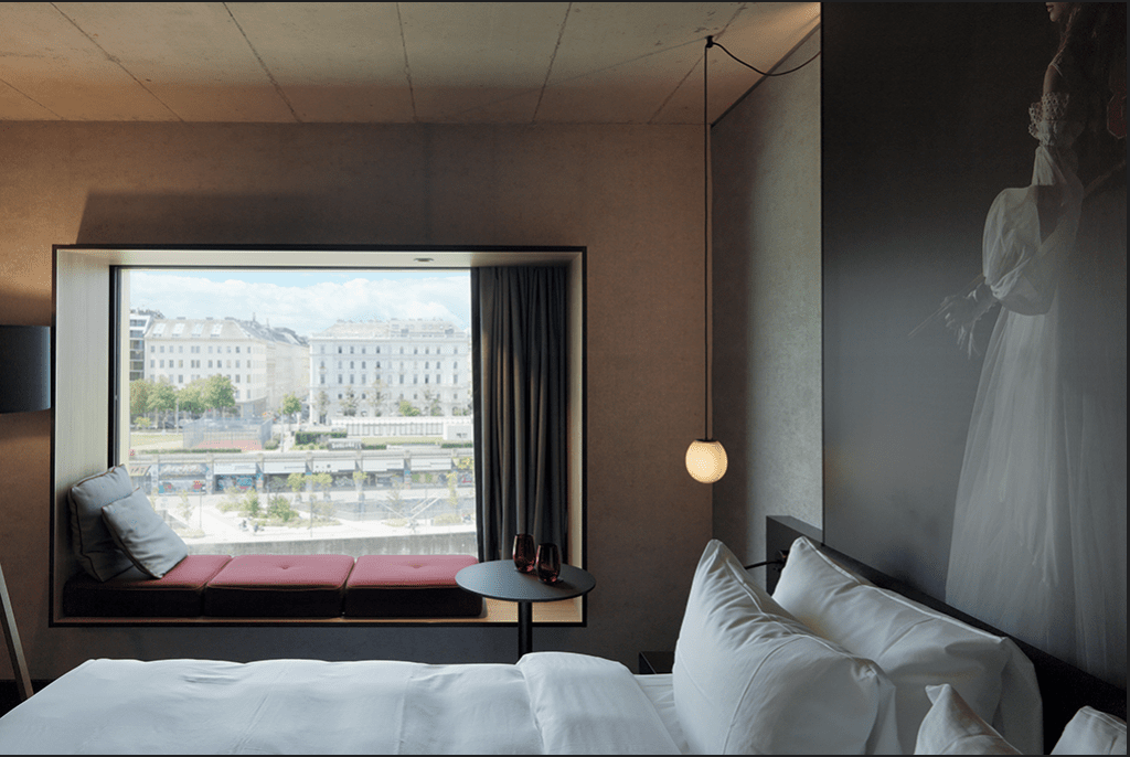
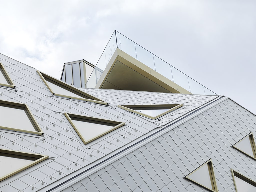
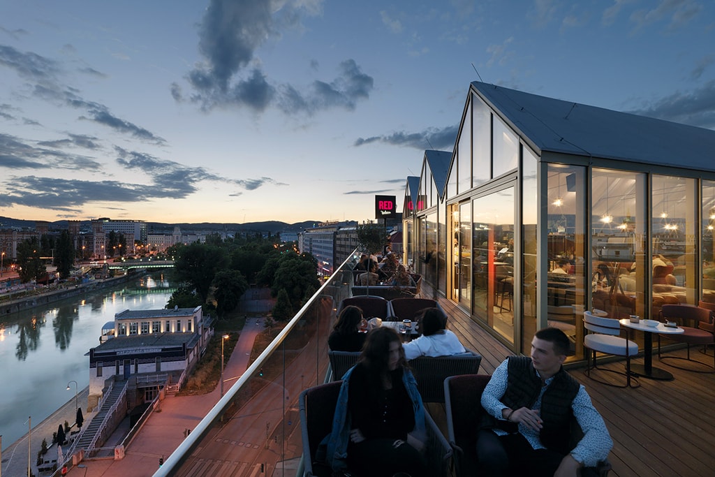
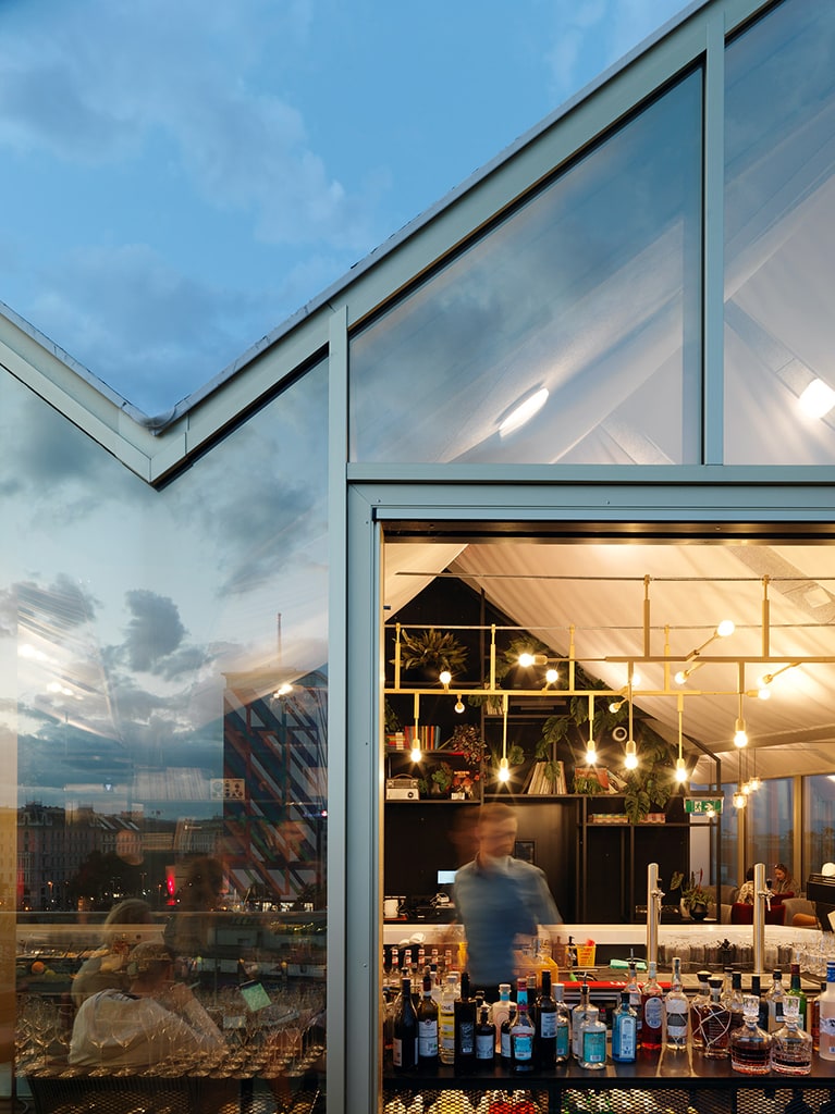
The site, in a prominent location on Vienna’s Danube Canal with views of the sights of Vienna’s Old Town, required special design care. The expressive, monolithic architectural concept, whose volume continues the historic perimeter block development, is identity-forming with its characteristic form. The diamond-shaped aluminium façade cladding, which seamlessly covers the building from the outside, unites the façade and roof into a homogeneous structure that emphasises the uniform, stone-like appearance. The uniformly structured building skin is only broken by the gold-bronze mirrored windows, which protrude slightly from the façade. The roof terrace, as a public space, cantilevers over the building as a platform with three interconnected glass houses and enters into dialogue with the city of Vienna below and the Danube Canal flowing by, explains Martin Lesjak.
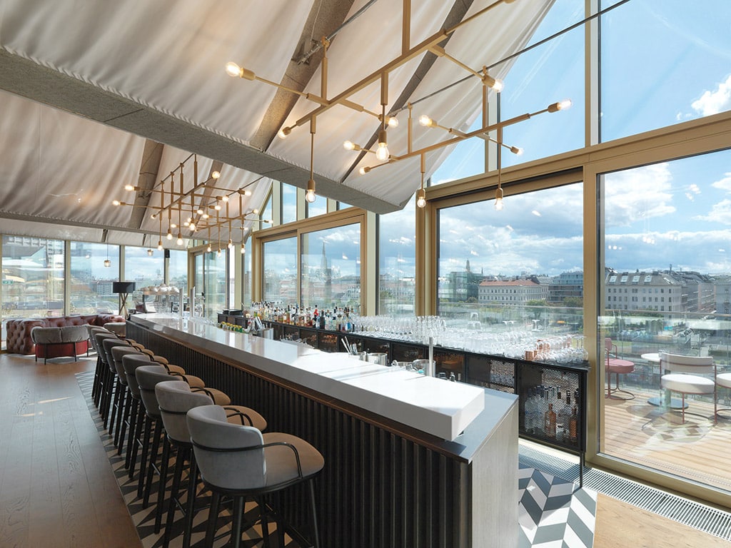
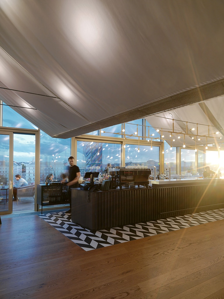
This architectural attitude is also carried over into the design of the top floor, where a light, floating textile ceiling stretches tent-like above the Skybar, blurring the boundaries between inside and outside.
The local contextualisation is further cultivated through the finishes and materials in the interior, linking them to the Radisson design guideline and furniture choices curated by the hotel group. In the rooms, the windows are shaped into a seating area, the so-called “Living Windows”, and invite the viewer to contemplate the surrounding environment with its bustling waterfront. Martin Lesjak emphasises that in this way even the hotel windows encourage interaction with the outside world and underline the open character of the building. In addition, a biophilic lighting series integrates nature into the interior and creates a balance with the urban context.
INTRODUCTION TO THE DRO COLLECTION BY 13&9 FOR WEVER & DUCRÉ
Humans tend to surround themselves with nature and organic life forms. The concept of Biophilia is increasingly being used in the design of working and living spaces, as people increasingly long for a connection with nature to counterbalance technological progress.
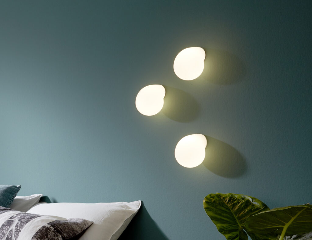
DRO was born out of the idea of Biophilic Design. The drops that rest in the space have a positive effect on people’s minds and enhance their well-being by integrating organic forms and light into the built atmosphere. “We wanted to interpret processes from nature in an artistic way,” Dr. Anastasija Lesjak, head of 13&9 Design, tells us.
What inspired you to create your collection? What is the story behind it?
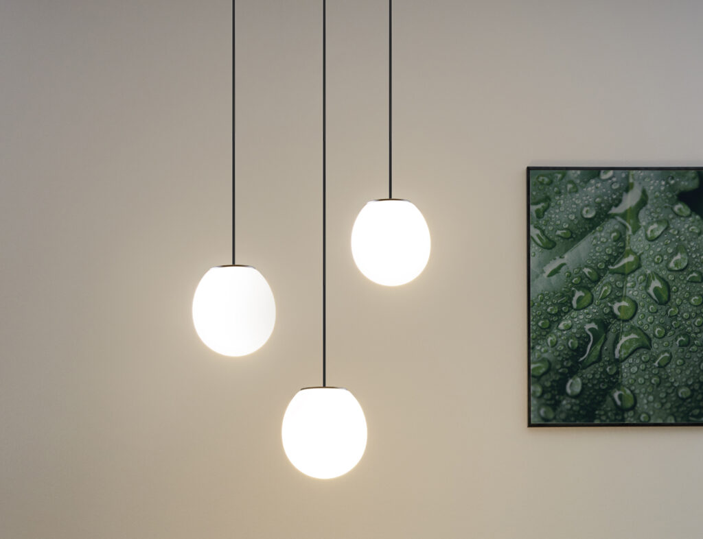
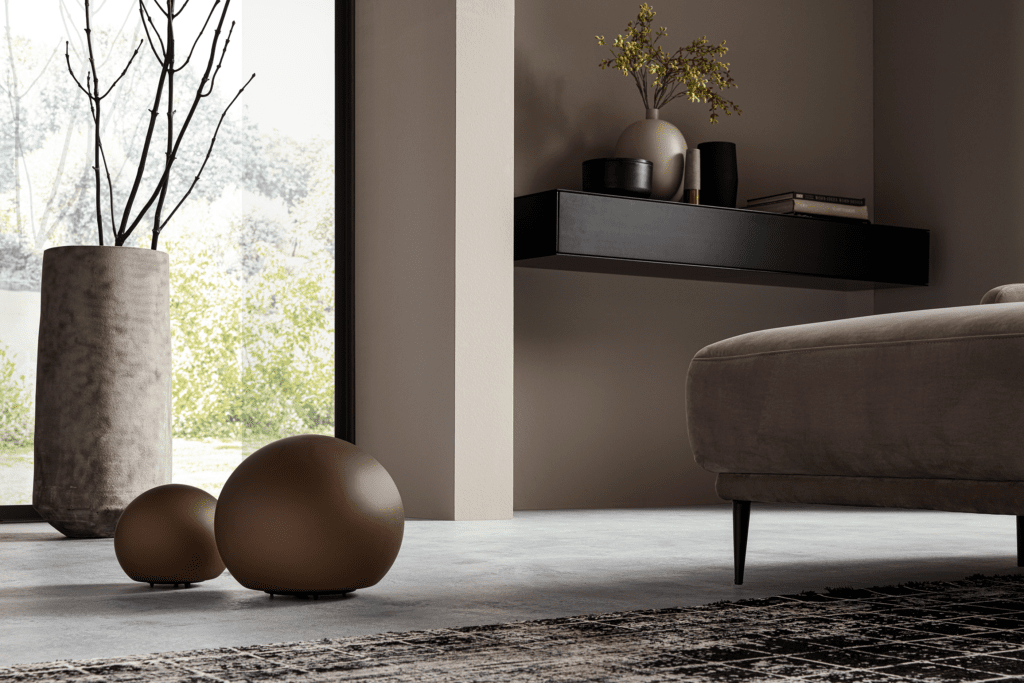
The product family, for the Belgian lighting manufacturer Wever & Ducré, is inspired by dewdrops adhering to leaves. The “hydrophobic” (water-avoiding) surface creates spherical drops that adhere to the leaves or roll off instead of seeping into them. Surface tension and gravity change the shape of the water depending on whether they hang, stick vertically or stand horizontally on a surface. This results in three different glass bodies, depending on how the lamp is used in the room.
Can you describe your design approach in one sentence? Or in other words, is there something like a “personal philosophy” behind all your designs?
The 13&9 design concepts deal with the needs of the individual in his interaction with the environment and tend to promote consciousness in consumption. The aim is to create new products with a variety of uses that encourage the user’s creativity. The interdisciplinary approach extends across all design concepts and development processes of products and projects and includes various external partnerships, cooperation with small manufactures and regional production to support a responsible approach to the environment.
Back to the topic of inspiration: Is there a theme that has particularly influenced you and your work? And if so – why?
For this project, processes in nature were our inspiration, close-ups of grasses woven with droplets, spider webs and flower petals. We were fascinated by the perfect organic form of water. Most of our concepts are science-based, as we founded the ScienceDesignLab together with Prof. Richard Taylor from the University of Oregon and his colleagues from the School of Psychology at UNSW Sydney.
Photo – and Videocredits: Paul Ott, Paul Geipel, Salvatore Guido

iThere are no comments
Add yours