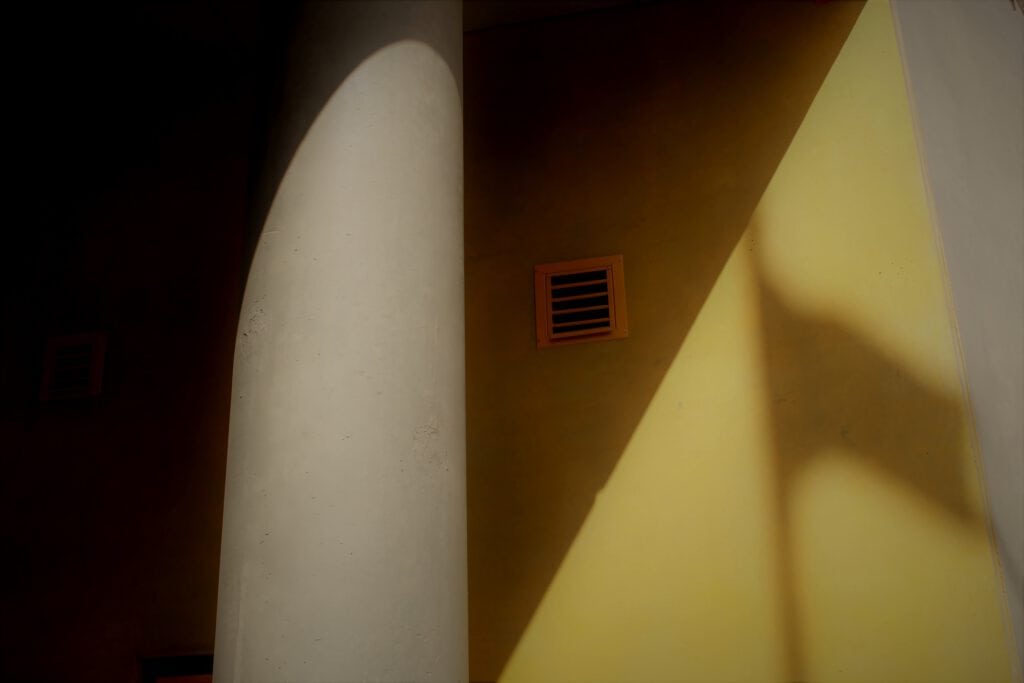
When it comes to clear design language, beauty lies in the simplicity and purity of forms. It’s about removing unnecessary elements and focusing on the essence of the design. Here, less is certainly more.

Rather than using a plethora of colours and patterns, designs tend towards clean lines and spaces so as to draw the eye towards the key components. Calmness and order set in and the observer is able to concentrate on the beauty of simplicity. Anything superfluous is eliminated and functionality is placed front and centre. Clarity prevails, and distractions are avoided. As a result, it’s a case of ensuring that clarity doesn’t equate to boring or simple, but rather a question of balance of form and function.

Various forms can be found at the Geba rug gallery, clear design is the norm at 13&9 Design, and we create clarity at home thanks to lamps from Creative Industries Styria.


iThere are no comments
Add yours