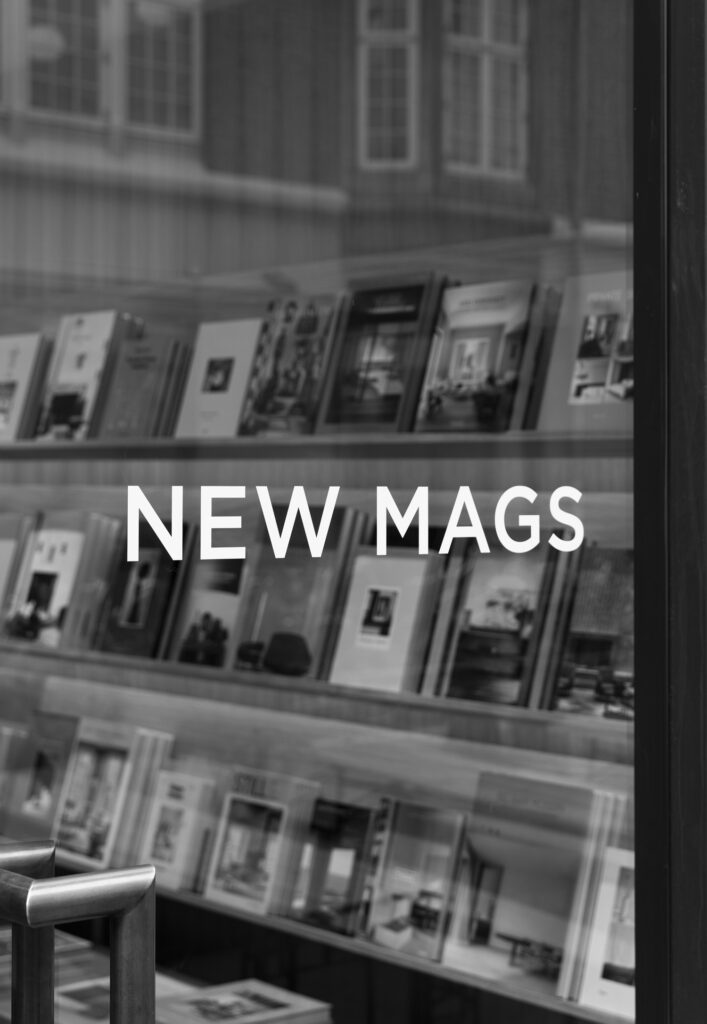
With its newly designed flagship store in the heart of central Copenhagen, Scandinavian distributor of coffee table books, New Mags, opens its doors to a world of unique and carefully curated lifestyle books, collectables, and magazines. Norm Architects has created a space comprising several functionalities within a calm and tranquil setting, allowing the products to stand out and invite exploration.
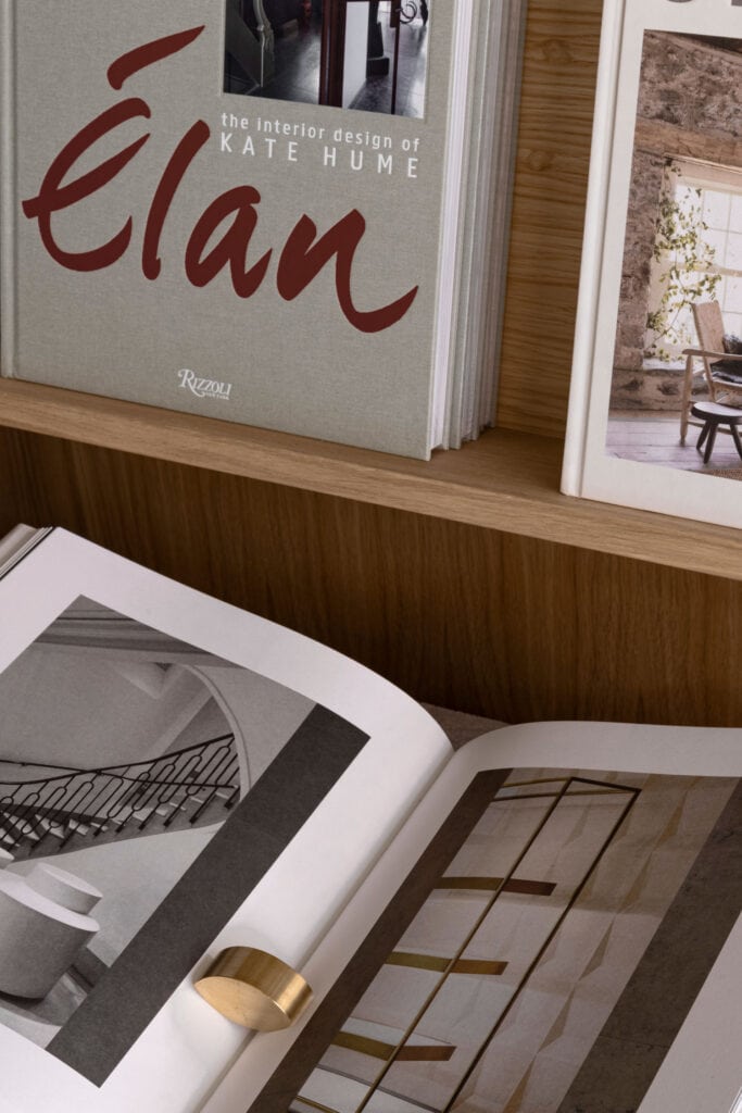
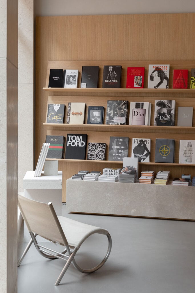
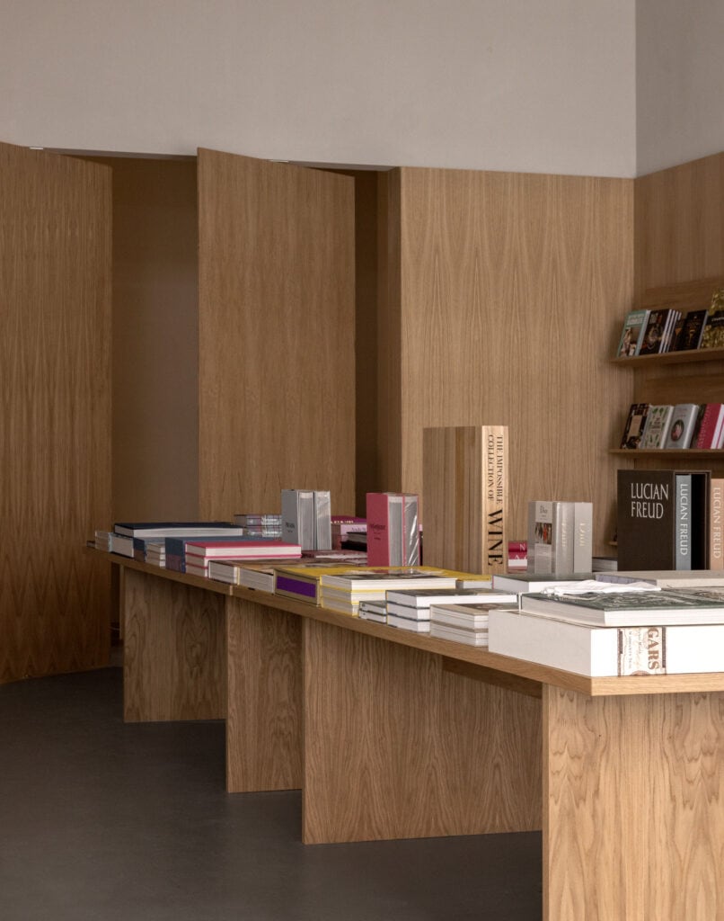
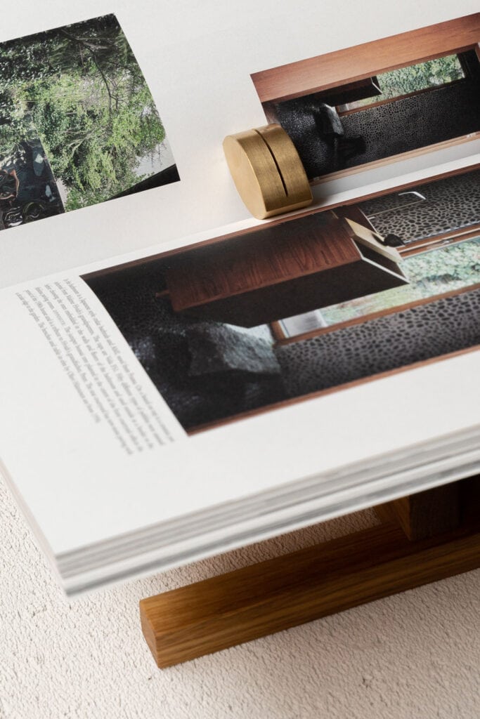
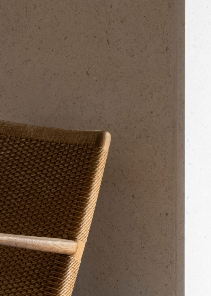
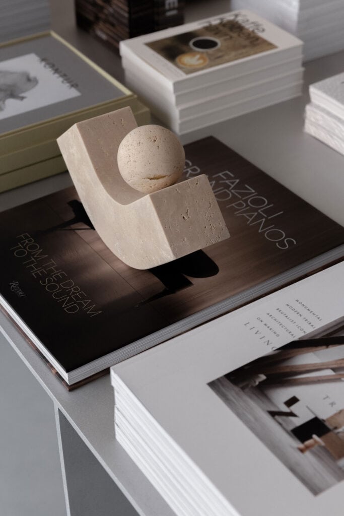
The calm subsides when entering the new flagship store of New Mags located in an exclusive area of the old City of Copenhagen; Ny Østergade. Taking inspiration from traditional libraries, the space heroes the unique an carefully curated coffee table books, allowing them to serve as artworks on equal footing with selected sculptures and objects. Natural materials like oak wood and golden sandstone act as the tranquil framework as you immerse yourself in the meaningful, the beautiful, the big, the small, the weird, and the essential books. Books that remind us of what we love and what is important, what we have been, what we are and what we can become.
A stimulating clash of materiality, form and function creates this dynamic space, embracing the essence of New Mags as a brand, while showcasing the protagonist of the space – the curated coffee table books – in a warm ambience with room for contemplation amidst unique artworks.
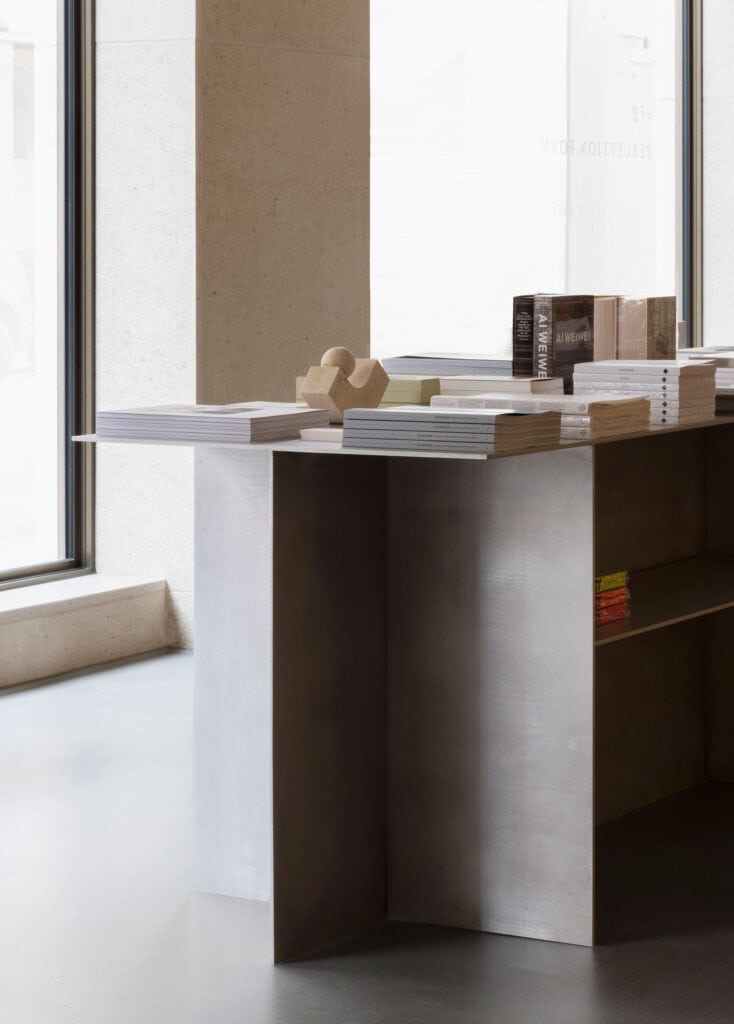
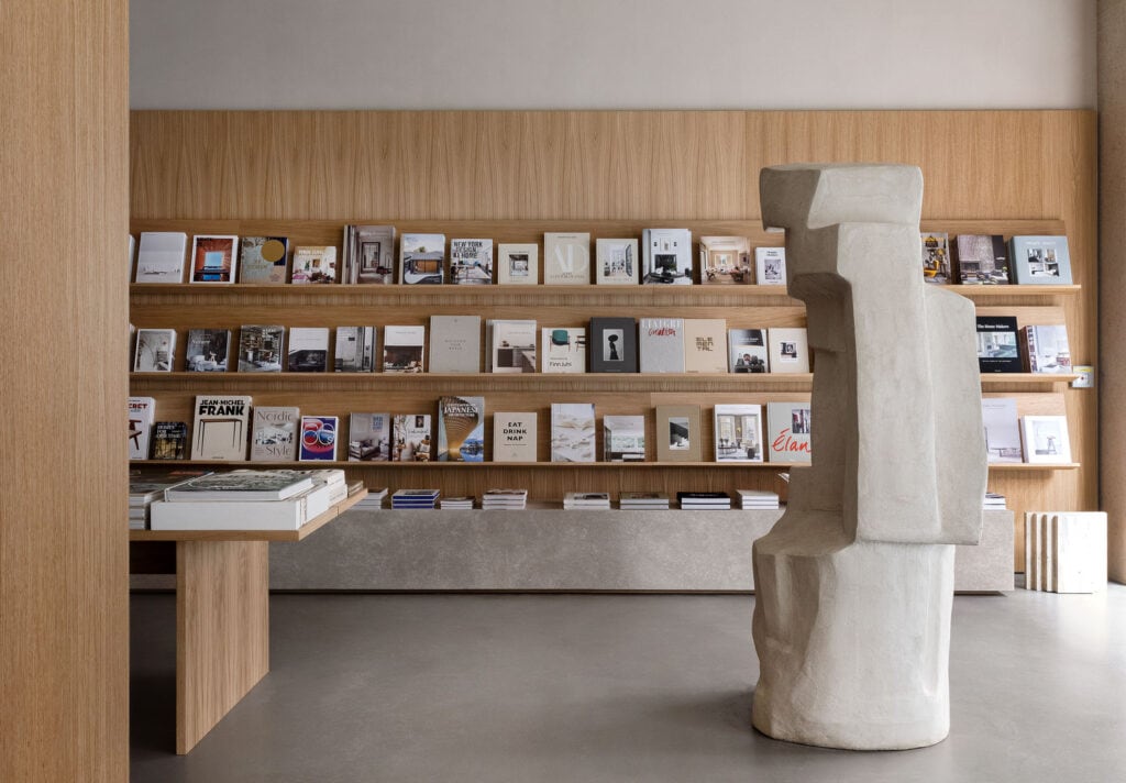
As inspiration for the project, we looked at the book-lover’s paradise; the library. And with iconic elements like the long study tables and large wooden shelving, filled to the brim with beautiful and large volumes alongside prominent sculptures and ornamental moldings in mind, we set out to design a contemporary and more minimalist version, where all the books are still displayed in this warm, cosy and stimulating atmosphere.
– Jonas Bjerre-Poulsen, Norm Architects
Encasing wooden panels cover the walls in correspondence with the division of the grand façade windows and fold through the entire space to create a room within the tall space that feels warm and embracing. Hence, the oak veneer walls not only echo the wooden landscape of a traditional library, but also create the vertical division that was needed within the existing silo-like architecture.
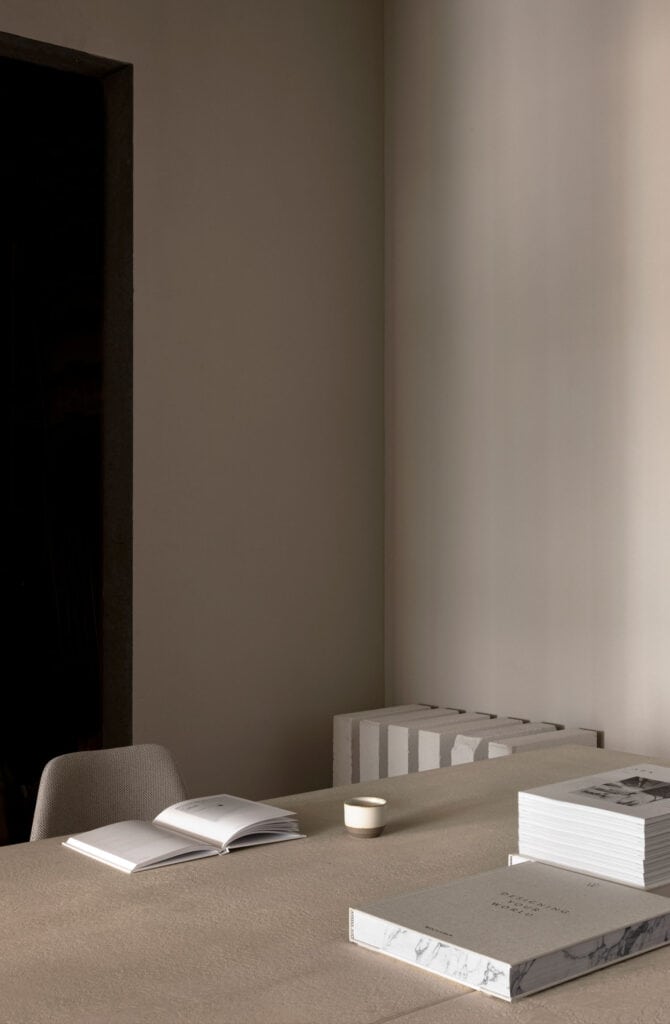
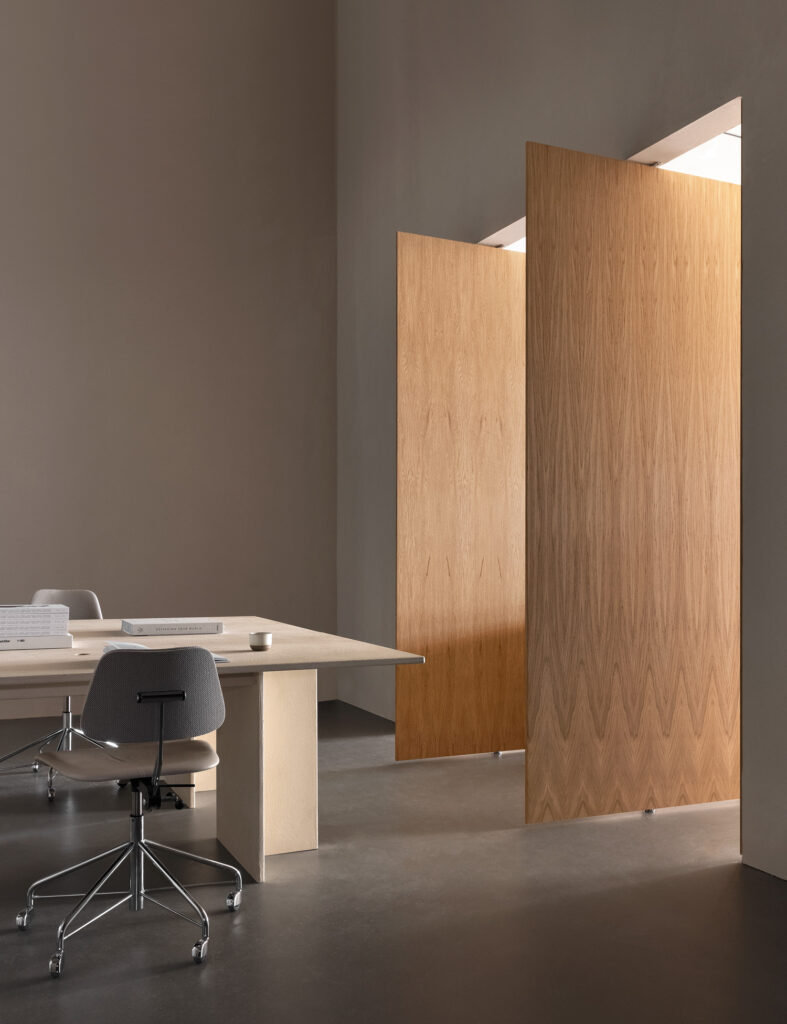
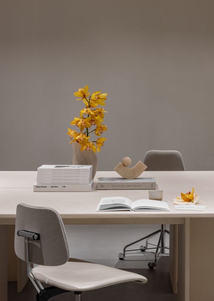
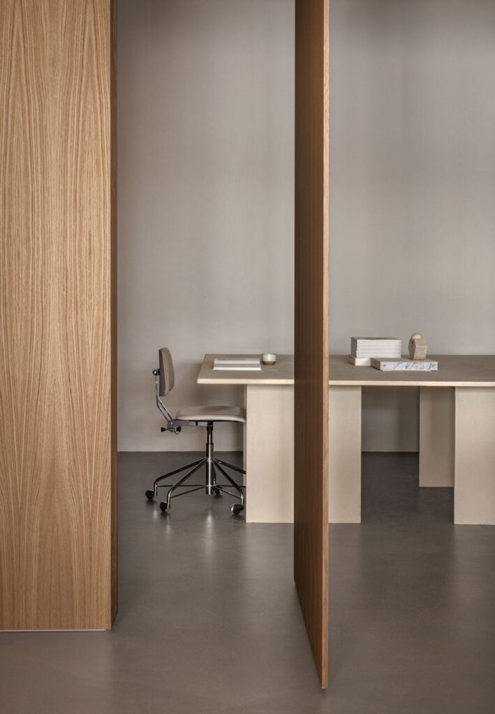
Connecting the retail element with the core of the company, two pivoting parts of the panel wall reveal an office space in the back of the store for occasional drop-down workplaces, meetings or for customers to sit in peace and quiet when flipping through a book – a feature that allows for the space to have several functions without any unnecessary clutter, as it can be both closed off and open to the public, depending on the given situation and need.
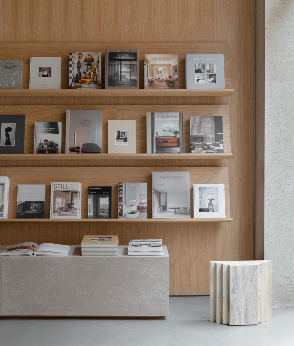
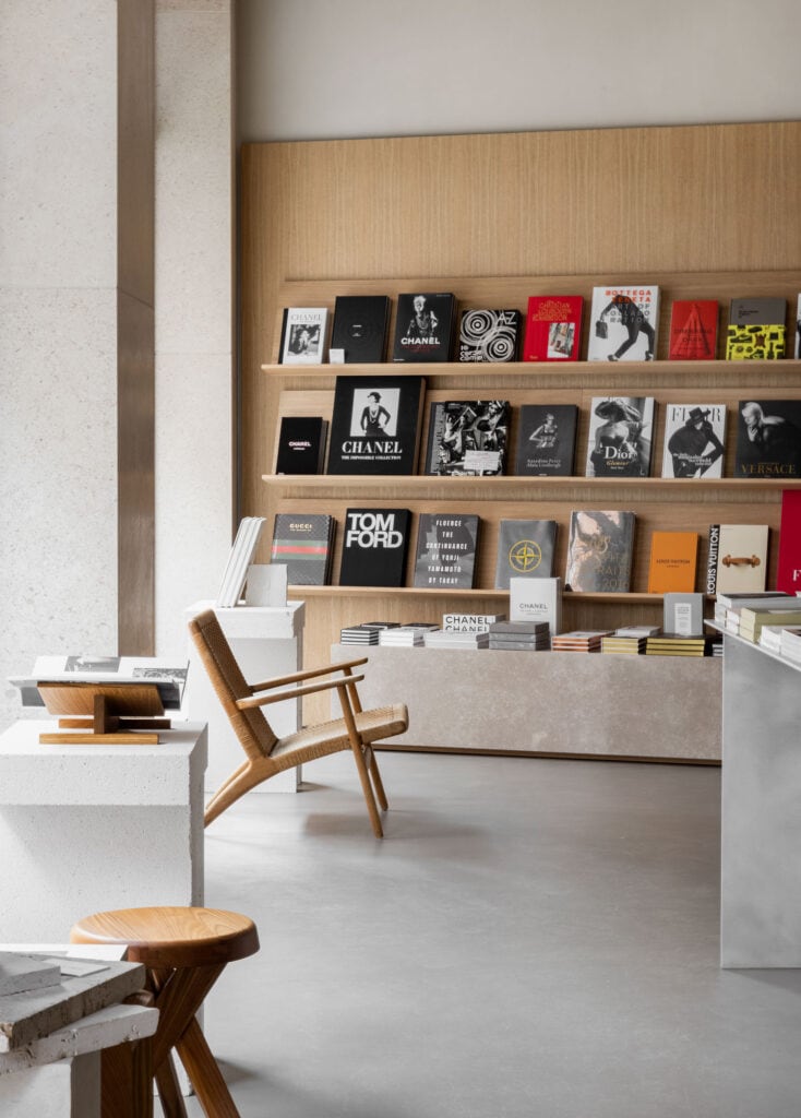
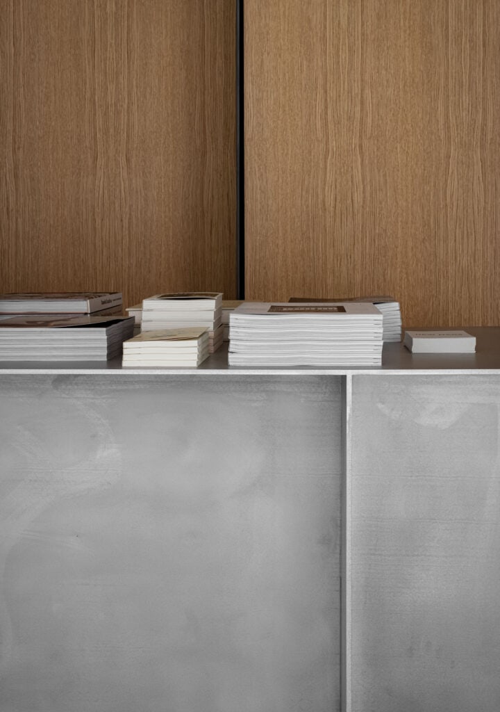
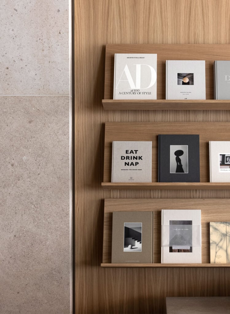
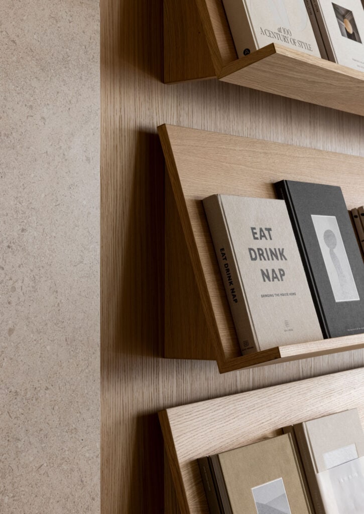
Moreover, the use of oak wood recurs in the wall shelving, resembling those of the library, and in a long study table, gracefully tying the interior together, while also breaking up the space.
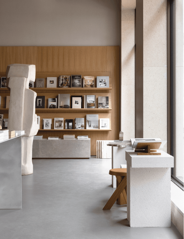
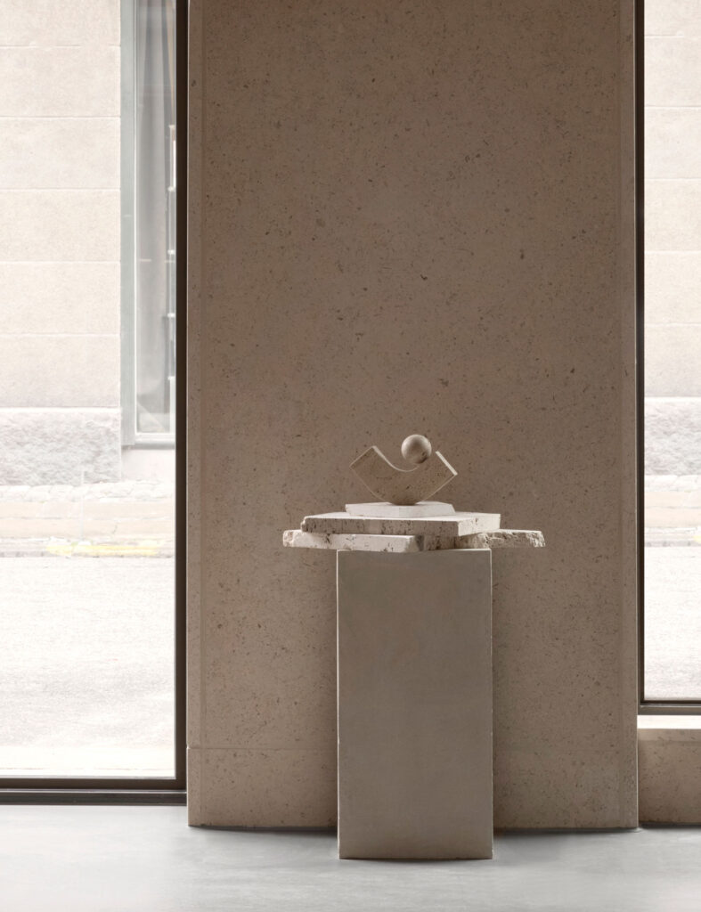
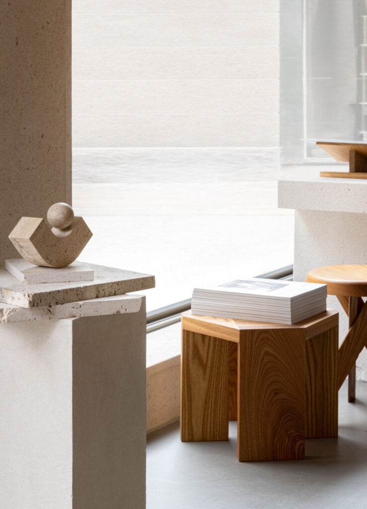
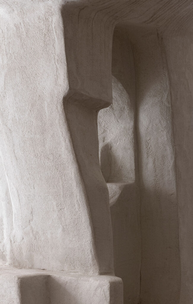
Being located on the ground floor of a newly built and award-winning property, we wanted to integrate the exterior within the store itself to honor the materials and create a synergy between the two. The sandstone on the façade building is therefore repeated on inside columns, just like the cast concrete flooring has the same colour and level as the pavement outside the shop, so that the street now flows naturally into the space, when the large glass doors are open.
– Jonas Bjerre-Poulsen, Norm Architects
The main feature of the space is the folding panels in natural oak, cleaning up all the irregularities of the architecture and acting as both a display wall and room divider, while providing hidden storage in the nooks and crannies of the existing structure. Visually they also ‘cut’ the spatial feeling vertically into a more well-dimensioned space.
– Jonas Bjerre-Poulsen, Norm Architects
The use of the stone sculpture by Josephine Winding is multi-faceted. First of all, it was our contemporary take on some of the reference images we looked at in the design phase from old libraries, where sculptures were placed on plinths among the study tables and rows of shelves. Secondly, it was a way to create a welcoming gesture to the space, create a bit of division and variance in heights as well as adding a soft and organic contrast to the straight-lined and architectural elements.
– Jonas Bjerre-Poulsen, Norm Architects
Photo credits @normarchitects
Architects: Jonas Bjerre-Poulsen & Marie Liebhardt
Client: New Mags
Location: Copenhagen, Denmark
Completed: Fall, 2021
Total square meters: 100 m2
Photography: Jonas Bjerre-Poulsen & Sandie Lykke Nolsøe
About New Mags
New Mags is a Danish company that has successfully created an exclusive universe and has become the ultimate supplier of the latest and most trendy magazines, the most delicious travel guides, and beautiful coffee table books. They collect, publish and distribute the meaningful, the beautiful, the big, the small, the weird, the essential. Books that remind us of what we love and what’s important. What we have been, what we are and what we can become.

iThere are no comments
Add yours